
What a Racing Livery Knows About Stopping
13 October 2026 · 5 min read
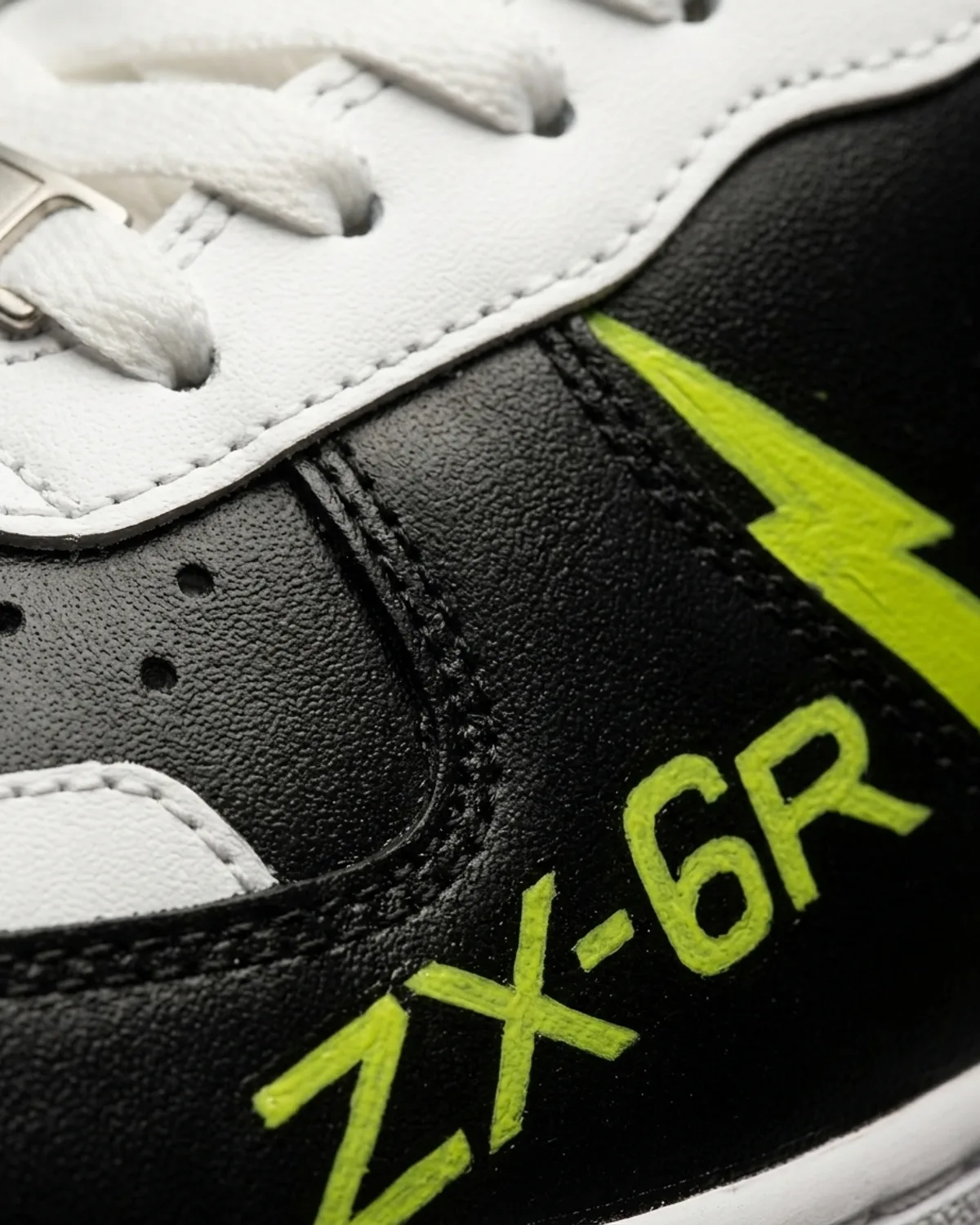
A motorcycle fairing and a shoe have almost nothing in common as objects, but they share one constraint that shapes everything: both are seen for about a second, in motion, from the side. A racing livery solves that problem by removing things. Fewer colours, bigger shapes, lettering that survives being glanced at. It is one of the few design traditions that is openly, unapologetically about legibility, and it is a useful thing to borrow.
The ZX-6R pair is built on that logic rather than on reproducing a bike. The quarter and mudguard go matte black, the rest of the leather stays white, and the boundary between them follows the shoe's own seams instead of cutting across them. That last part matters more than it sounds. A panel line that follows a seam reads as though the shoe was made that way. A line that crosses one reads as paint, and the eye finds it immediately.
Then one accent colour does everything else. The swoosh is outlined rather than filled, which keeps the shoe's most recognisable shape present without letting it dominate a design that is not about it. A bolt is struck through the panel. The model name is lettered on the quarter. That is the entire vocabulary: an outline, a mark, and some type.
The lettering is where hand work and decal work genuinely part company, and it is worth being honest about the trade. A decal is perfectly even. Hand lettering is not, and on close inspection you can see it: the downstroke of the R is a fraction heavier than the one on the X, because a brush loaded at the start of a character carries more paint than it does four characters later. We could correct that. We do not, because evenness is the thing a printer is for, and a shoe that was going to be perfectly even did not need a person.
Ride or Die sits on the other shoe, small, low, near the toe. It is placed where it is almost never visible: not on the quarter where a wearer would see it looking down, but in the one spot that only appears when a foot comes up. Half of what makes a commissioned object feel personal is that some of it is not on display. Every pair we paint has at least one element positioned for the person wearing it rather than the people looking at it.
The acid green is the only colour on the shoe and it is used four times. There was a version of this design with the green also run along the midsole stripe, and it was rejected, because the moment the accent appears in five places it stops being an accent and starts being a scheme. Racing liveries understand this better than most design disciplines. A works bike generally has two colours and a sponsor block, and it is legible from the far side of a circuit.
The useful lesson, for anybody thinking about commissioning anything, is that subtraction is not the same as minimalism. This is not a minimal shoe. It has a bolt, lettering, a colour-blocked upper and a hidden line of script. It is just that each of those earned its place by being the only thing doing its particular job.
Ready to Start Your Own?