
Painting a Shadow Means Leaving Somewhere for It to Fall
13 October 2026 · 5 min read
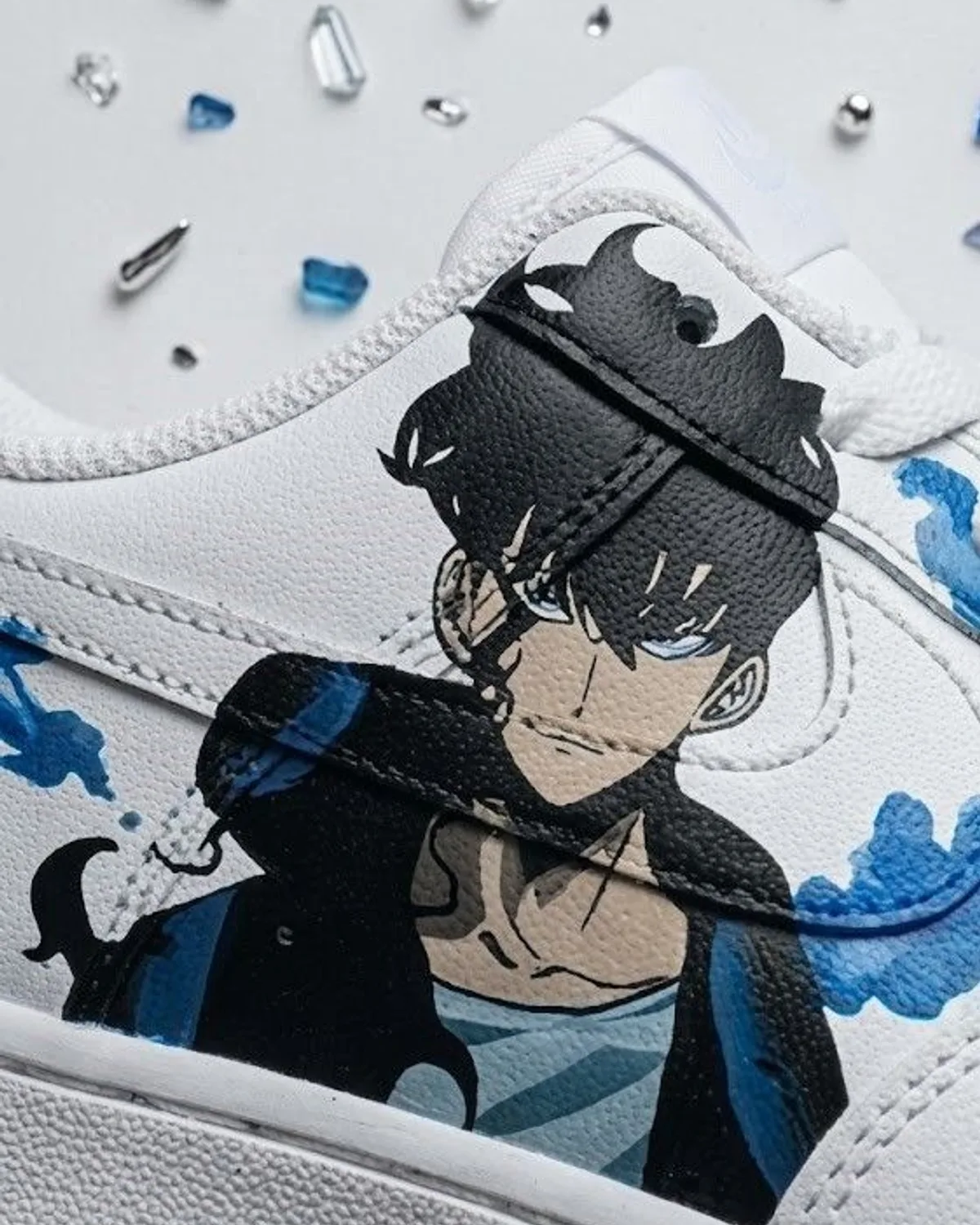
The request that produces a pair like The Devil almost always arrives the same way. Somebody sends a character, usually armoured, usually drawn in heavy black, and asks for it on a shoe. The instinct that follows is nearly always the same too: go dark with it. Black the quarter, flood the toe, let the whole shoe carry the mood. It is the wrong instinct, and it is worth setting out why, because it is the single most common thing we talk a client out of.
A shadow is not a colour. It is a relationship between something dark and something lit, and it stops existing the moment you remove one half of it. Paint a shoe black from toe to heel and you have not made a shadow, you have made a black shoe. The figure disappears into the field it was supposed to be cast across. What looked in the reference like menace reads on the finished pair as a smudge, and nobody can tell you why, only that it has gone flat.
So on this pair the leather is left white, and the drawing is given the job of moving across it. The figure is set at the quarter, where the panel is widest and flattest and a face has room to be a face. From there the ink is allowed to leave it: tendrils carried over the toe and down towards the midsole, each one laid in a single pass rather than built up in strokes, because a line drawn in one movement keeps its taper from root to tip and a line that is gone over twice does not. That taper is the whole difference between ink that looks like it is spreading and ink that looks like it was painted on.
The blue goes last and goes thin. There is a temptation with a cold accent colour to use it as a highlight everywhere the black looks heavy, which is how a design ends up lit from six directions at once. Here it sits only where a single light source would actually catch: the leading edge of the armour, the inside of a curling tendril, the top of the figure's shoulder. Three or four placements across the pair. The restraint is doing more work than the colour.
There is a practical reason the bare leather matters as much as the compositional one. An Air Force 1 quarter bends every time the wearer walks, and paint laid across a crease at full opacity will eventually tell you where that crease is. Keeping the heavy ink to the flatter parts of the panel and letting the thinner work run over the areas that flex is not an aesthetic decision, it is a durability one. It is also why the tendrils thin as they travel: they are thinnest exactly where the shoe moves most.
The reference sheets this design was worked out on are photographed with the pair, which is deliberate. The line drawings came first, at size, on paper, and several of them were wrong before one was right. Working out where a figure sits on a curved panel is not something that can be done on the leather, because leather does not forgive a redraw the way paper does. By the time a brush touched the shoe, the composition had already been settled three times over.
When somebody asks us for a dark pair, what they usually want is a dramatic one. Those are not the same request. The drama in this pair comes from how much of it was left alone, and a client who understands that tends to end up with a shoe they still like in two years. The ones who insist on flooding it get what they asked for, and we paint it, but we say this first.
Ready to Start Your Own?